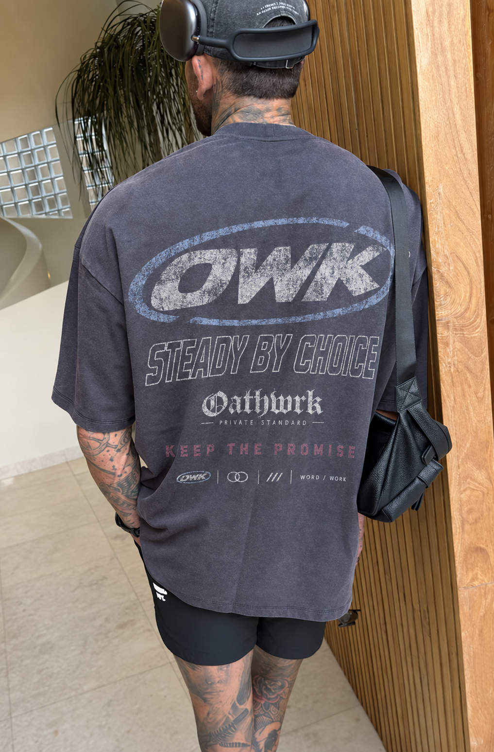
Hero / primary reference
The original pillar
The clearest brand anchor. The turned pose and everyday styling give the image more life than a comparison board.
Design assessment / 13 October 2026
The clearest direction is worn, graphic streetwear: charcoal and bone, faded blue, large back prints and quiet fronts. The saved favorites establish that language more convincingly than another theme or a new name.
Selection basis: the user’s explicit favorites first, followed by refinements that preserve their strongest qualities. Newer does not automatically mean stronger.
The edit / ranked by role and cohesion
The homepage needs range within a recognizable system. A campaign anchor, four complementary tees and one simple cap are enough to establish it.
Hero / primary reference
The clearest brand anchor. The turned pose and everyday styling give the image more life than a comparison board.
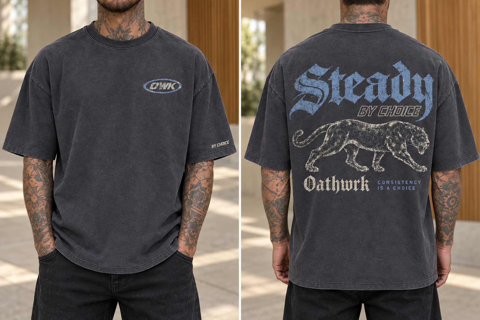
Graphic tee / refined favorite
Blue Gothic type, a bone illustration and a small front mark. The strongest recent refinement of an explicitly liked composition.
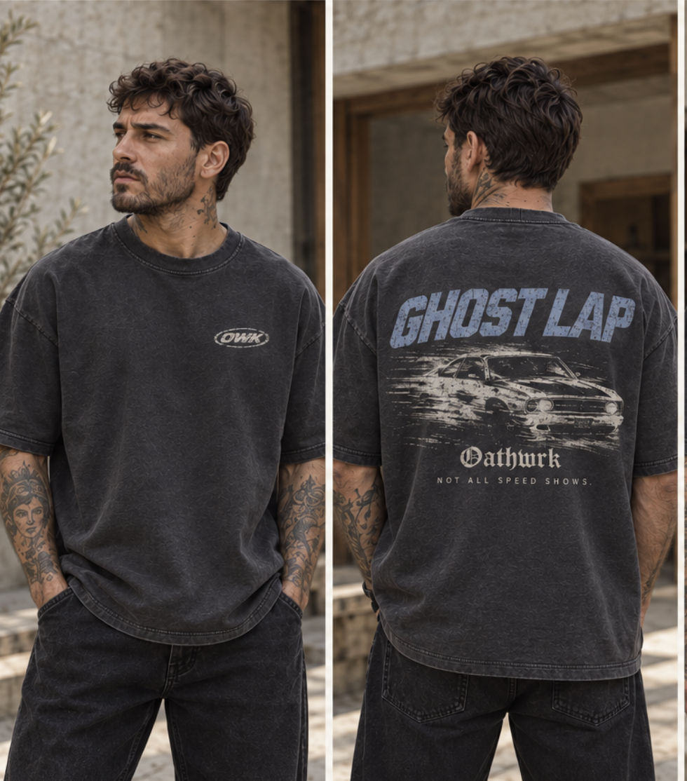
Graphic tee / explicit favorite
The coupe adds energy and a different subject. Keep the liked classic-car composition prominent; it gives the assortment character.
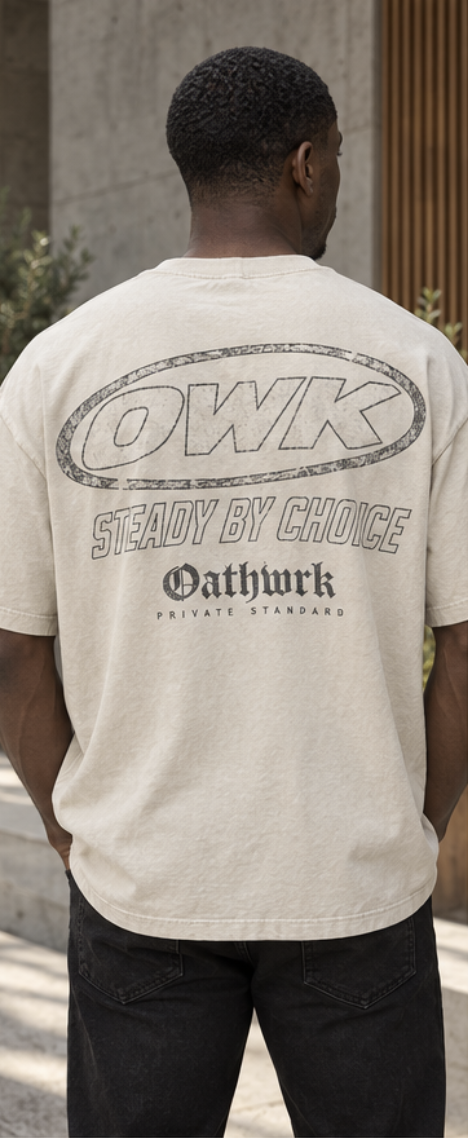
Light colorway / explicit favorite
The strongest contrast to charcoal. Open lettering carries the same identity with less visual weight.
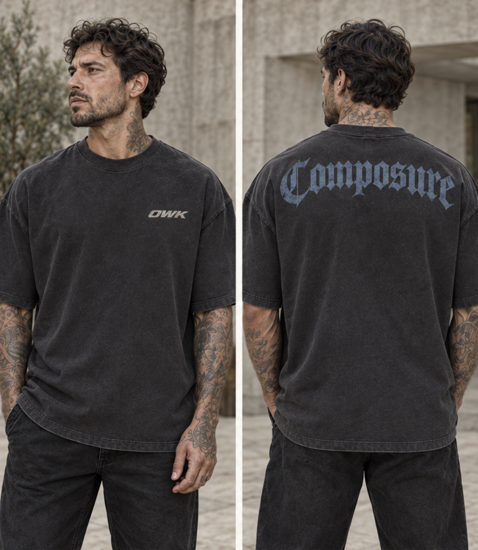
Quiet tee / explicit favorite
A useful pause between illustrations. The single shoulder wordmark and small front mark prove the system works without a full slogan stack.
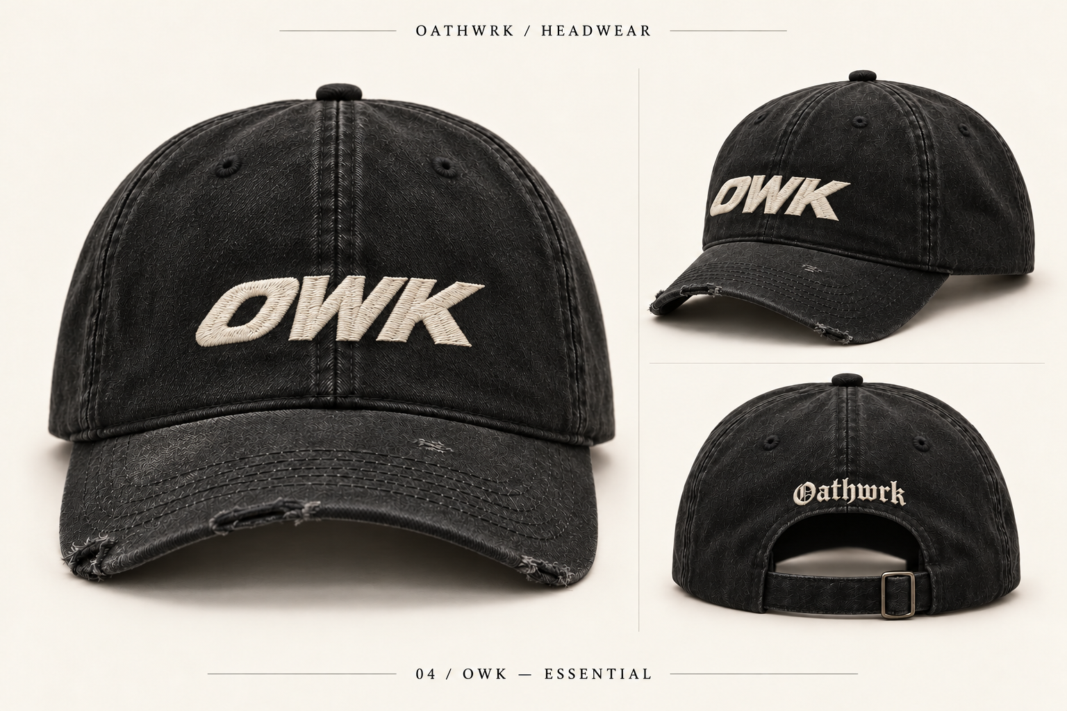
Accessory / supporting choice
Direct, readable embroidery. It connects the looks without introducing another message or competing graphic.
Keep in the wider collection: Becoming and Resolve extend the established type and symbol families. The horse studies are the strongest additional story; a dedicated editorial feature gives them context without crowding the opening edit.
What still needs work
Choose one primary oval, one racing wordmark and one Gothic signature. Keep their letterforms and proportions stable across garments and the site.
Repeated messages about discipline and self-improvement can feel over-explained. Preserve the favorite artwork, then test fewer supporting lines and more room around it.
Use consistent image crops and clear front/back views. Some favorites are softer screenshots; fine ornamental fabric texture in the mockups is a rendering artifact, not an intended cotton pattern.
The name / still open
The design can be assessed before the name is settled. OATHWRK is the provisional label here because it is already present in the selected artwork.
Established visual system
Fits the existing Gothic and racing marks and the idea of a personal standard. Its risk is tonal: the surrounding copy can make it feel more solemn or motivational than the clothes need.
Alternative direction
Could support a rawer, more social world built around friends, movement and shared nights. That is a creative hypothesis, not a settled identity; the name and GWK marks need to be judged as a complete system.
The practical next edit
Keep this six-piece selection and the provisional name. Give the homepage short, garment-led copy and a little more social energy through photography. Then compare both names on the same small set of garments and page layouts, so the name decision is not confused with a change of art direction.